/ blog · 2022 · react · css
How to implement horizontal media scroller component in React with CSS only
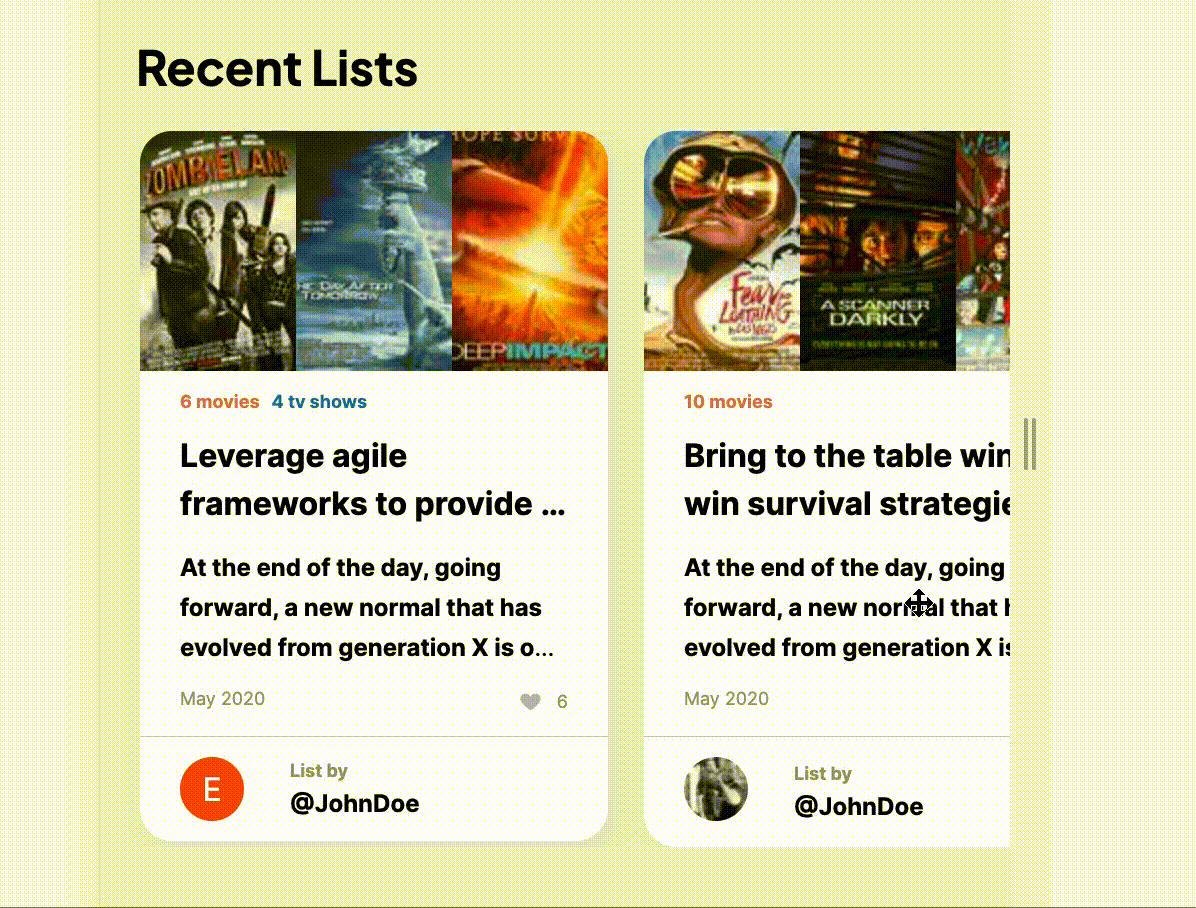
A copy-paste snippet for implementing a swipeable carousel or so called media scroller component. Built with almost no-JS.
It is a common practice to render list in form of horizontal swipeable carousel on mobile resolutions. For that I created a simple, almost no-JS component for that. It uses JavaScript only for centering the overflow container.
I used styled-components and styled-breakpoints for this, but you can easily transform this to any other CSS-in-JS approach.
import { Container } from 'components/Container';
import { useEffect, useRef } from 'react';
import { down } from 'styled-breakpoints';
import styled from 'styled-components';

const GridContainer = withTheme(styled.Container)\`
  \${down('sm')} {
    max-width: 100%;
    margin: unset;
    padding: 0;
  }
\`);

const Grid = withTheme(styled.div<{ desktopMinWidth: string; mobileMinWidth: string }>\`
  display: grid;
  grid-template-columns: \${({ desktopMinWidth }) => \`)repeat(auto-fill, minmax(\${desktopMinWidth}, 1fr))\`};
  grid-gap: 18px;

  \${down('sm')} {
    padding: 0 20px;
    position: relative;

    cursor: grab;
    scrollbar-width: none;
    -ms-overflow-style: none;

    ::-webkit-scrollbar {
      width: 0px;
      background: transparent;
    }

    display: flex;
    overflow-x: auto;
    scroll-snap-type: x mandatory;
    -webkit-overflow-scrolling: touch;

    & > * {
      min-width: \${({ mobileMinWidth }) => mobileMinWidth};
      max-width: \${({ mobileMinWidth }) => mobileMinWidth};
      scroll-snap-align: center;
    }
  }
\`;

interface SwipeableGridProps {
  mobileMinWidth: string;
  desktopMinWidth: string;
  children: React.ReactNode;
  className?: string;
}

export const SwipeableGrid = ({
  mobileMinWidth,
  desktopMinWidth,
  children,
  className,
}: SwipeableGridProps) => {
  const swipeableGridRef = useRef<HTMLDivElement | null>(null);

  useEffect(() => {
    const currentEl = swipeableGridRef.current;
    if (currentEl) {
      currentEl.scrollLeft = currentEl.clientWidth / 2;
    }
  }, []);

  return (
    <GridContainer>
      <Grid
        desktopMinWidth={desktopMinWidth}
        mobileMinWidth={mobileMinWidth}
        ref={swipeableGridRef}
        className={className}
      >
        {children}
      </Grid>
    </GridContainer>
  );
};